Wednesday 30 March 2011

Final Design

Here is my final wallpaper design, which will eventually be screen printed onto lining paper, meaning I can alter colour if I choose to. I have chosen the three kitchen items and subtly placed text into three of the items. I am pleased with how it has turned out and like the simplicity of the initial drawings. After editing and using a process of elimination I feel I have made the right choice! Lets hope the wallpaper goes to plan...

Tuesday 29 March 2011

Re-working and Incorporating Text


I have been playing around with text and different layout options for my wallpaper. I want the wallpaper to include the text 'home what home?' again s a subtle implication towards what my project has been based on. I like the idea of typing this inside some of the homely objects as it feels quite ironic. These objects would fit in with the moto 'home sweet home', yet by reversing the text in this instance I feel it makes quite a statement.

I have tried switching the objects around seeing what looks best and I don't feel the mirror works in the image. First of all, the others are cliched kitchen items and I also think the shape doesn't fit how I wanted it to. I have learnt a lot in this process, particularly on photoshop, having to edit and re-size the images to fit. I have decided on a final layout which I will post next!

Wallpaper Experiments


\
I have began experimenting with wallpaper designs for my final degree show piece. I wanted to create something which wasn't just text, as I had previously done. I thought that by continuing text it might look too busy and might be a bit too overpowering. Instead, I have opted to use objects from around a home reflecting home comfort. These objects, shown above, a teapot, cup and saucer, mirror and doily are all cliched house items which I think adds to the idea of the room on wheels.

These images are my initial paintings which I will then edit to create an appropriate design. 

Wednesday 23 March 2011

Wallpaper Decisions

home sweet home home sweet home
home what home? home what home?
home sweet home home sweet home
home what home? home what home?

Can't decide on a font for my wallpaper...

Park Benches


I have also been testing just my cushions on park benches, again as a way to draw attention to the public for those who don't have a home. Three of the cushions say 'Home Sweet Home' and one says 'Home, What Home?' which I think is important for this mini-installation to work. I think that by subtly changing the order of the cushions means that the audience wouldn't necessarily notice the alteration of text.

I am pleased with how my experiments went, but again I think I need to make my cushion text bolder for it to stand out on the photographs. However, if the cushions could stay outside on the bench for just passer-buyers to see then the project has worked, as the work isn't for a good photograph it is to make a point, so hopefully I have done this.

Life on Wheels


I have made a little carpeted piece of MDF on wheels! The idea is a sort of mini installation which can be moved around as and when the person chooses. It can be used to store their items and then can be pulled along or can be used as a place to sit/eat/sleep. Obviously, this all relates back to my 'flat pack/portable home' idea and I thought it would be a good idea to do a smaller scale version as a test run. Also, to check any areas which are of importance to me and will need improvement. I found with this particular test, a handle on on of the ends would have been a good solution to dragging it along, also bigger wheels would have helped this too.

Anyway, yesterday I took my board on wheels on a little tour of where I live to see how it adapted to it's surroundings and how it worked on location. Initially, a park which I think is appropriate as often a bench is a sleeping area for some people. I then tried it outside a stately home, more as an ironic idea than anything else. Each photo, I used the same furniture, including my 'home sweet home' and 'home what home?' cushions just a quick subtle reminder to people what it is I am trying to achieve.

Overall, I am pleased with my results. I would next like to try it in a few more locations and also try furniture such as a table and chairs for eating. I think the text on my cushions could be bolder for these particular shots, so that may be an area I work on next.

Tuesday 15 March 2011

Outside Cushions


I have began experimenting outdoors with my cushions. I have first tried them in my garden and then against a brick wall outside. I think the images with the brick wall as a back drop work the best as a garden isn't realistic of what I am trying to represent. 

Ideally, my chairs would match. yet I want them to still have an old quality to them as I think modern chairs don't feel right when I have tried them. The text on the cushions stands out but I think for my final degree piece I may make the text even larger, yet still keeping the same style font.

To take this further I plan on using the chairs in another, even more suitable location. Perhaps in sheltered alley ways and similar areas. Also, the cushions could be used alone on park benches and bus shelter sheets.

Saturday 12 March 2011

Home, What Home?


I have made these four cushions in preparation for the up coming degree show. I wanted to do four test cushions before designing and making the real ones. Here, I have hand stitched 'Home Sweet Home' into three of the cushions, leaving one to say 'Home, What Home?' in the hope that the viewer will have to look twice before noticing one is different. I am eager to create something quite subtle with my audience and hopefully this slight change of wording will help convey this.

I have taken photos of the cushions inside my home temporarily, yet they will be used outdoors, preferably in a row on chairs, after seeing some of the images from Speleotherapy they have inspired me to create a similar atmosphere. 

Wednesday 9 March 2011

Kirill Kuletski- SPELEOTHERAPY

(Images taken from http://www.kuletski.com/projects/ukr16.htm)

Artist Summary 

Kirill Kuletski is a photographer born in Russia, now living in London. His current work looks at using photography as a means to capture mood. The images above are from a project called 'Speleotherapy' a treatment which helps those suffering asthma and respiratory diseases at a centre near Romania.

My Thoughts

Although these images may look like an installation, they are actually a real experience where those suffering asthma can go to get treated. The patients stay here, underground for 24 days and there can be as many as 200 patients at any one time.

My reason for looking at Kirill Kuletski's in this instance is due to the nature of the images. I found them immediately fascinating and almost representing some sort of prison. However, people go here by choice, and it seems crazy! However, my main reason for finding these images so intriguing is the fact that they represent somewhere being a temporary home to people, much like my portable home idea. The notion that people live in temporary accommodation on a regular basis had never really occurred to me but is actually a very real thing, whether it be a hospital or a holiday. However, in this instance the whole treatment centre feels very make shift in comparison with usual places of treatment. It's strange to me as the area as a whole feels like it's outside, yet it is actually 300 metres underground. It made me think how underground areas don't represent home as no-one ever really lives that far underground.

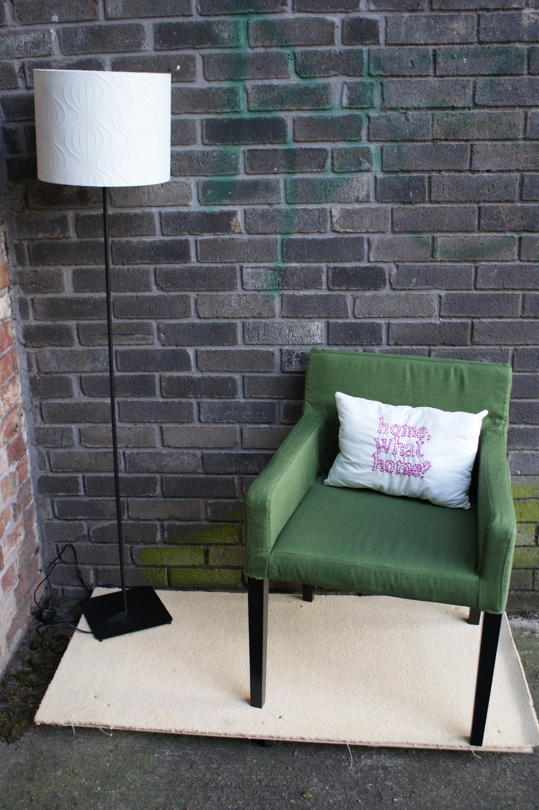
Kuletski's images feel installation like, yet they are obviously very real and happening everyday. The main attraction for me to these images is that I feel I could create a very similar feeling and atmosphere within my own project. Perhaps creating beds outdoors or having chairs outdoors. By placing these objects in an unknown environment is very appealing to me and relates well with what I am trying to achieve. I like the familiarity of everyday homely objects, such as chairs and tables yet in an unnatural surrounding. 


Public Toilet


A public toilet in Norway

Culturstruction


(Images from http://culturstruction.wordpress.com/artworks/)

Aritst Summary

Artists, Jo Anne Butler and Tara Kennedy work collaboratively via a project called 'Culturstruction'. Their work aims to combine 'art and architecture to explore ideas of cultural production within the built environment.

My Thoughts

Culturstruction's work is very relative to my own, not conceptually but their use of being site specific and working on location, often outside. The image above I particularly like as it uses a children's sized castle as a representation of the real castle in the background. What interests me about this is the idea of a scaled down version of something, which I will be producing when creating my portable room. The piece will represent a homely feel, yet obviously isn't the real thing, similar to this installation.

The artist's also made a 'pop up park' which arrived in pieces and was constructed on site. This idea of a flat-pack park which has to be constructed on location is again similar to what I am trying to produce. I find the artist's useful when thinking of the logistics of how to construct something. The work of Culturstruction is very interesting, by combining child's play with architecture it forms work which has a function to it and also is very fitting to it's location. I hope for my degree show installation I will follow the same approach of functionality and concept, which works specifically on site.

Seamus Nolan- Hotel Ballymun


(Images from http://www.hotelballymun.com/room_detail.php?rn=r9)

Installation Summary

'Hotel Ballymun' was a project done in 2007 by artist Seamus Nolan. The project was formed around an abandoned tower block due for demolition. The entire top floor of the tower block was transformed into a hotel where guests could stay and admire views of Dublin. The entire hotel consisted of nine bedrooms, a conference room, a disco room, garden room and common room. In addition to this, each room was furnished by artist's who took items left over from ex-residents to create something new and useable with them.

My Thoughts

I find this project very interesting and inspiring. First of all, I am attracted to the idea of transforming an abandoned space into something useful, in this case something homely. The idea of something old (the furniture and the building) being reused and reworked is a concept which appeals to me greatly. The contrast between the before and after images shown above is intriguing. It fascinates me that prior to this, people didn't want to stay in the tower block or even live there eventually, yet as soon as this project sprang up the hotel was fully booked. I believe this comes down to aesthetic and social backgrounds. I imagine the typical residents of the hotel would not normally be the type to live in this area or this building.

The concept, to me is very influential. Although my work is almost exclusively outdoors, I aim to transform an area which isn't pretty or isn't desired into somewhere which can become a home-like place to somebody. Similar to Nolan, my work aims to make a space seem habitable and homely in comparison to it's previous look. 

people dont want to live there but now want to stay there