Monday 31 January 2011

Studio BUNTING!


I finished my bunting today, hurrah. I have chosen to use a gingham fabric, as typically it represents a homely feel. My two lots of bunting say 'home sweet home' and 'home, what home?'. I plan to use them in an outdoor environment, which I will do this week. Again, exploring the ideas of what a home really is and how homelessness is a problem within Manchester. I also like the idea of outdoor graffiti, which I mentioned earlier with my wallpaper. I want to decorate outdoor spaces with attractive items. 

Friday 28 January 2011

On Location


I have taken my 'Home Sweet Home' wallpaper and tried it on location. Here, I have used an old passage way. I don't want this to seem incredibly stereotypical of where a homeless person would sleep, but from my time spent working with them I am aware this is sometimes the case, due to them often having a roof. However, what makes a home? Is it somewhere where we just sleep? These are ideas I would like to explore during this project.

I have hung the wallpaper up inside the passage way amongst graffiti and it has quite a dingy atmosphere. What I like about the wallpaper is the fact that setting this up is actually graffiti yet in a different context. Is graffiti OK if it is pretty to look at? Or if it suggests positivity? 

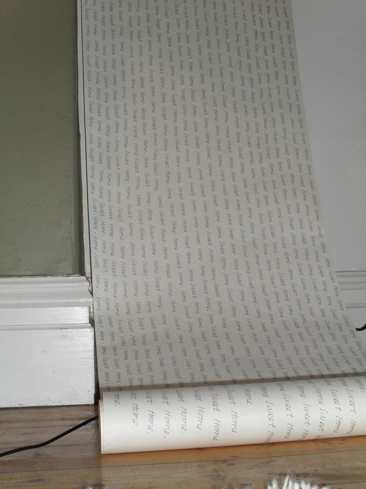
The wallpaper has the words 'Home Sweet Home' printed thousands of time to represent the amount of homeless people and refugees who where on the streets or searching for homes in 2010, in Manchester. The number is vast and I like the idea of the wallpaper almost becoming a pledge and a statement to help solve this situation. 

Although I am happy with the statement I am trying to get across, my aim is to produce something which looks much more professional. Currently, the white paper and small text blend in too well with the surroundings. To create a 'portable' home I want something that to the human eye looks as if it was bought and is unnatural in its environment, yet holds a homely quality as it is something we are used to seeing but in the wrong location. 

This initial experiment has been a success, but my plan is to alter and improve on these current ideas and test them thoroughly. 

Tuesday 25 January 2011

Wallpaper


I have been continuing with my 'Home Sweet Home' theme and like the idea of a portable home that can be temporary. I have began printing the words 'Home Sweet Home' onto lining paper, repetitively to reinforce the concept and main objective. I would like to use the wallpaper on location, in areas outdoors that are home to people. In these images I have tested it inside the home to get an idea of how it hangs. This will not be the wallpapers location as my main focus is it for to be used in an outdoor environment, which is what i will do next. I would also like to introduce different sentences and phrases and entwine them into the wallpaper to create something which is quite subtle. I would like to cover an entire area with the wallpaper aswell as other objects that I have been creating. 

Monday 24 January 2011

The Weather Measure...


As I don't seem to be arguing at the moment I have decided to start a new knitting measure! It still relies on the same concept on knitting a row, yet this time I will knit everytime it rains. I feel British people are always discussing 'the weather' so I will knit the weather instead. So far, since January 1st it has rained 13 times in Manchester, therefore I have knitted 13 rows of stitching. At the end of each month I will cast off and start again, that way we get a measure of the rainiest month and can see if gradually towards Summer the weather improves. I personally have no problem with the rain but lets wait and see what the percentage of rain is! I am still continuing on my arguing knitting measure, yet it seems to be raining  (fortunately) s more often than my arguments at the moment! Ha.

Knitting Projection...


I have gone back to my projection roots! Here I have tried projecting different knitting samples onto t-shirts. I like the idea of creating something which is technically false imagery as it doesn't really exist. The T-shirt may look like it has a design printed on it, yet it actually isn't there. I wanted to communicate these ideas and continue with the idea of an ever transitional fashion industry. 


For this piece, I changed the background to black instead of the usual white, hoping the projection would only show on the t-shirt. However, I still got a projection onto the background and although unintentional I think it works well and is subtle in comparison to a white background which can sometimes take over the idea. 


I learnt a lot from doing this projecting, for instance the size of knit, certain samples didn't create any projection whatsoever. I also played around with different pieces of clothing to see which ones worked best. I even attempted to project onto shoes, which sadly failed. I like the idea that the work shows the viewer a pattern of knitting without it actually being knitting, which is a lot easier than ACTUALLY knitting. As confusing as that sounds...


This whole project became hugely experimental and I want to continue the theme, perhaps introducing buttons and other everyday clothing accompaniments that can become a representation rather than a reality.


Friday 21 January 2011

The Costume Gallery: Part Four


Some more images of garments from The Costume Gallery. As you can see the outfits span through many different eras. 

The Costume Gallery: Lady Sainsbury


Adnan Bayyat

'Lady Sainsbury'

My Thoughts

This piece in The Costume Gallery is made of over 1000 Sainsbury's bags croched together. I was amazed when I saw this piece as not only does it look fantastic, but it is so similar to my own work, when I created sleeping bags and coats made from plastic bags. The dress has a ball gown feel to it and from far away doesn't necessarily look like plastic bags, it is not until you get up close that you realise it's material. I am not sure the reasoning behind the piece, whether it is focusing on how many bags are wasted or if it is to shock viewers by making something ugly look pretty. Whatever the reason I find the dress very entertaining and personally think it sends a powerful message to those who consume such a vast amount of plastic bags. 

The Costume Gallery: Light Humour


Penelope Batley

'Light Humour'

Artist Summary

Penelope Batley is a past student from MMU, graduating in 2007. This installation is from her current exhibition in The Costume Gallery named 'Light Humour' which is giant, illuminated jewelry. She won the Terrance Conran design award in 2009 and her work was used for London Jewelry Week. 

My Thoughts

Upon entering The Costume Gallery, Batley's work hangs off a chair and over the grand staircase, projecting a subtle light around the steps. Her work is of a huge scale and gives the gallery a contemporary twist. I really liked the pieces and think that they are unusual in that we are used to seeing beads, yet not in these circumstances. I like how her work takes something simple and by changing the objects proportions she makes it something noticeable. The objects become playful and the light that glows from one bead makes them seem almost practical. Batley is not afraid to use bright colours in her work and I think this adds to the playful nature. I particularly like how the beads are draped over a chair, almost making the chair seem miniature and surreal. The work becomes a fantasy and has tones of something you might see in Alice in Wonderland and other surrealist works. Overall, I find the work inspiring and creating something off scale seems an excellent way of working. 


The Costume Gallery: Part One


Gallery Summary

The Costume Gallery in Platt Fields park is home to an incredible array of costumes dating back to the 17th century, aswell as current temporary exhibitions. The gallery is situated in a park in an old textile merchants home and due to it's size can only display a small selection of its collection. 

My Thoughts

This specific image is taken from a temporary exhibition in the gallery done by last years graduates from the Embroidery course at MMU. The exhibition features a variety of different hats, designed and made by the students. This particular hat was made by artist Sophi Aris and is very similar to other work she has produced. I love how the colours fade from pale grey to a darker shade and the way it would sit on the head and blend in with the wearers hair. The piece is handmade and is very carefully crafted, each square sewn on individually to create a raised shape that can be pushed together creating a concertina. Although my current work doesn;t concentrate on hats, I have made them in the past. I liked the idea of naming them 'head furniture' and I think this hat fits nicely with this phrase. 

Thursday 20 January 2011

Keeping Warm... Again!


Here are images of my first stencil attempt. I am happy with how they have turned out as an initial response but can see how they can be vastly improved. The stencil hasn't turned out as refined as I would like, so this is my next step of improvement. I think if my stencil was made of something thicker it would move around less. However, as a first try I am happy with how it has turned out. I seem to be ruining lots of socks though! 

Keep Warm: Stencils


I have decided to make a stencil to print directly onto the socks as this way I won't have to cut the material. I have had to make the font quite small so it will fit onto the sock and I have chosen quite a simple font, similar to the one on the original poster. I also quite like the idea of using the line 'Spare a Pair' as a way of telling the public to spare a pair of socks/food/blankets and getting the message out there. This is almost becoming a campaign! Hmm...

Keep Warm: Take One...


Here are my first initial experiments stitching into the socks with the message 'Keep Warm and Carry On'. I don't think here the stitching has been that successful and it involves having to cut the sock open and then stitch it back together to be able to fully complete the sentence. I think I will use stitching again but perhaps mark out exactly where to stitch so the work has more fluidity and a professional look. I also think I will try brighter threads, such as a red which will stand out better against black. I would like to include a variety of colour when it comes to socks aswell as the thread.

Wednesday 19 January 2011

Artists Who Use Text

Chris Johanson

Cary Leibowitz

Mark Mahosky

Heath Nash

Kate O'Connor

Trevor Reese


Alyse Santoro


Sighn

Here are some images I have found of artists who use text to create their work. I enjoy the variety of media each artist uses and the messages they each convey. As I am currently using text in my work I have found it useful to see what other artist's are doing with fonts and materials. I have been sewing into socks to convey my message aswell as making bunting featuring text and have come across artists who also use stitching as a way of expression. I want to try printing and stenciling text onto different items and develop the idea further.


(Images taken from http://aaronkrach.com/artists-who-use-text-to-say-nice-things/)